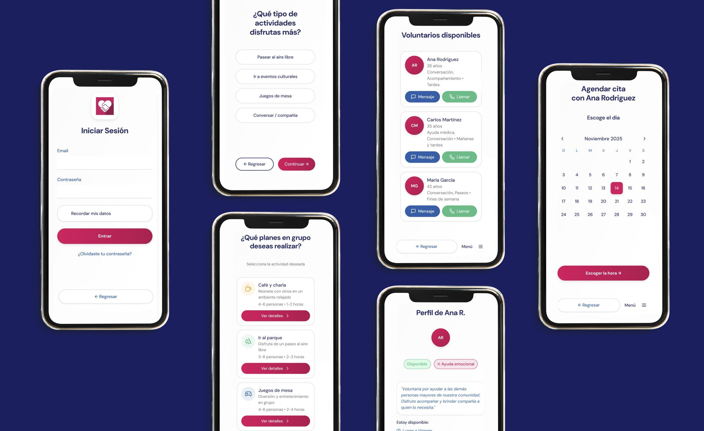
Measured results
Validated through field usability testing with real users over 65, conducted across Madrid, Toledo, and Barcelona.
6/6
Users completed their assigned tasks without critical errors, blocks, or external assistance
15 s
Time to complete session close flow — "Ha sido facilito" said the participant
0
Critical navigation errors detected across registration, booking, volunteer selection, and appointment flows
3
Targeted iterations implemented post-testing — all minor UX improvements, no structural redesigns needed
✦
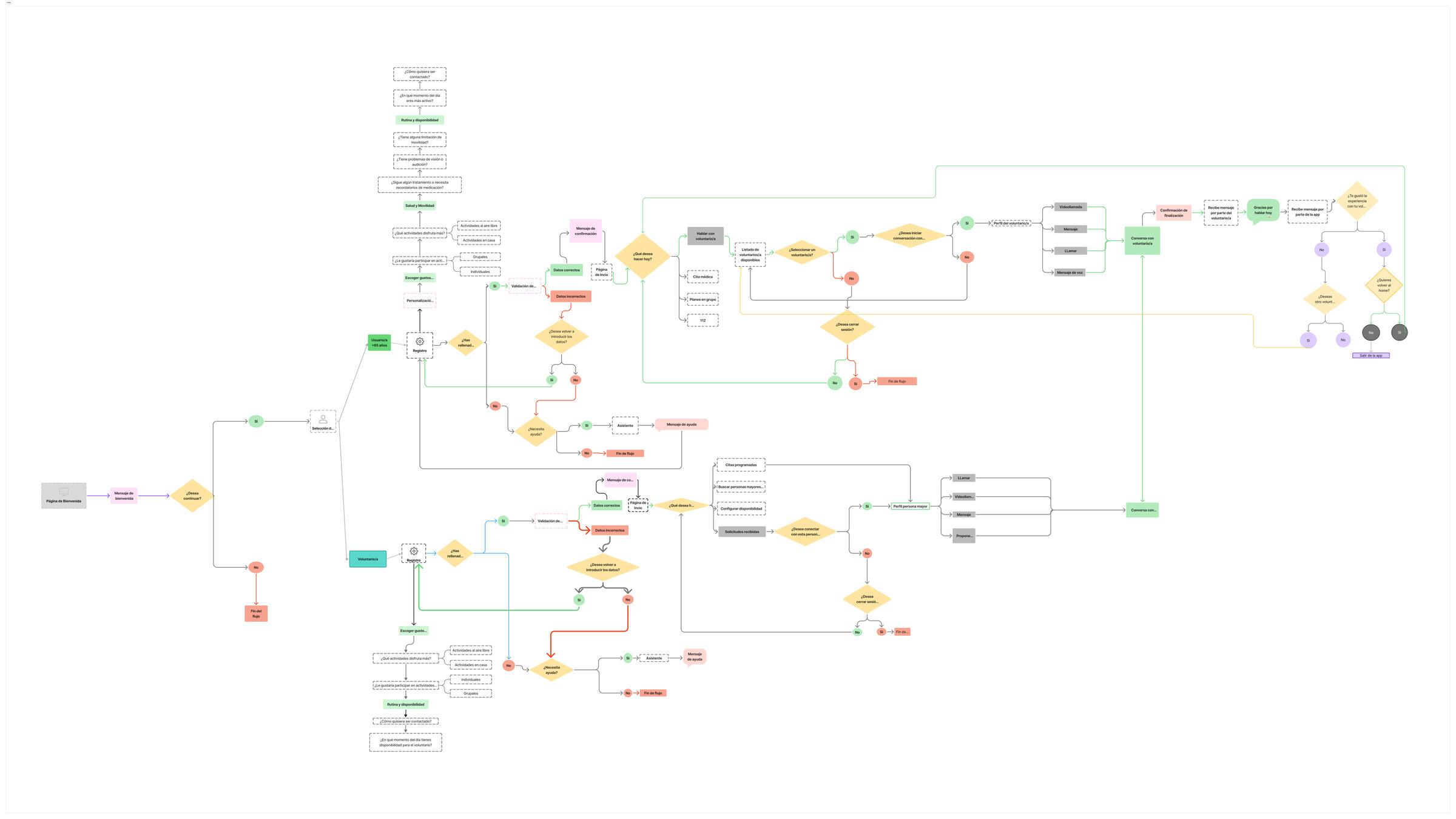
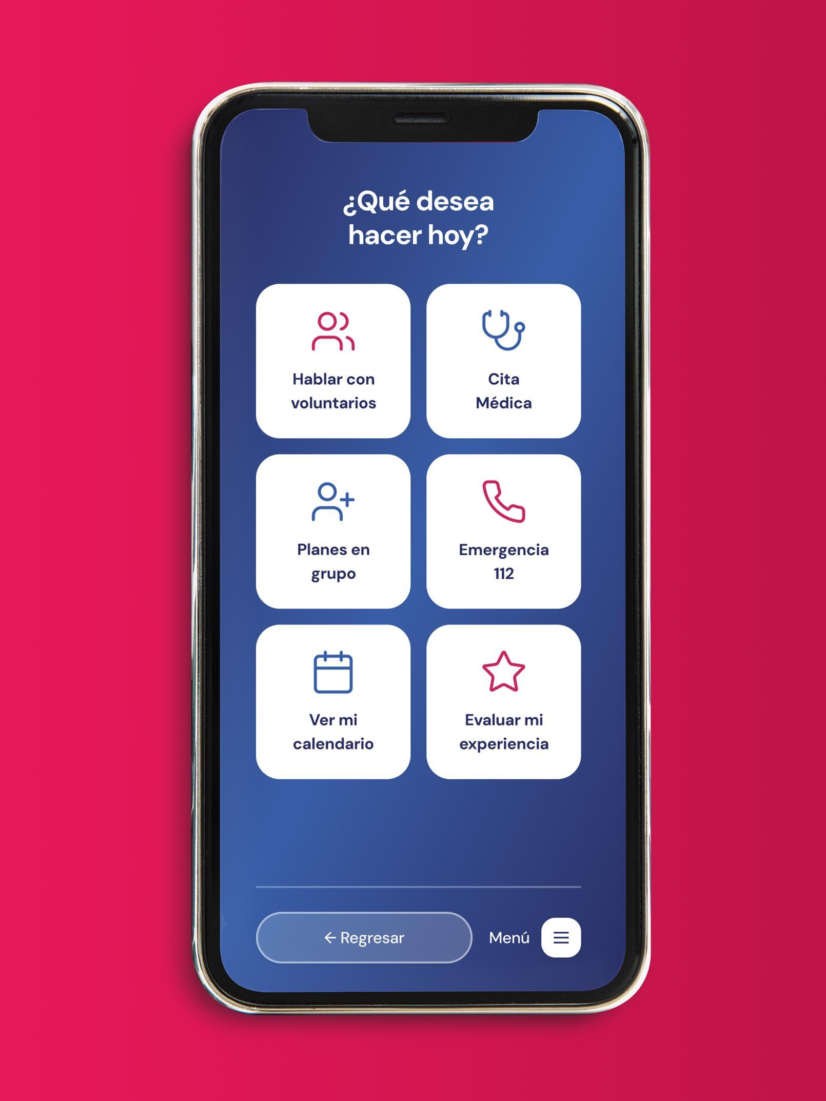
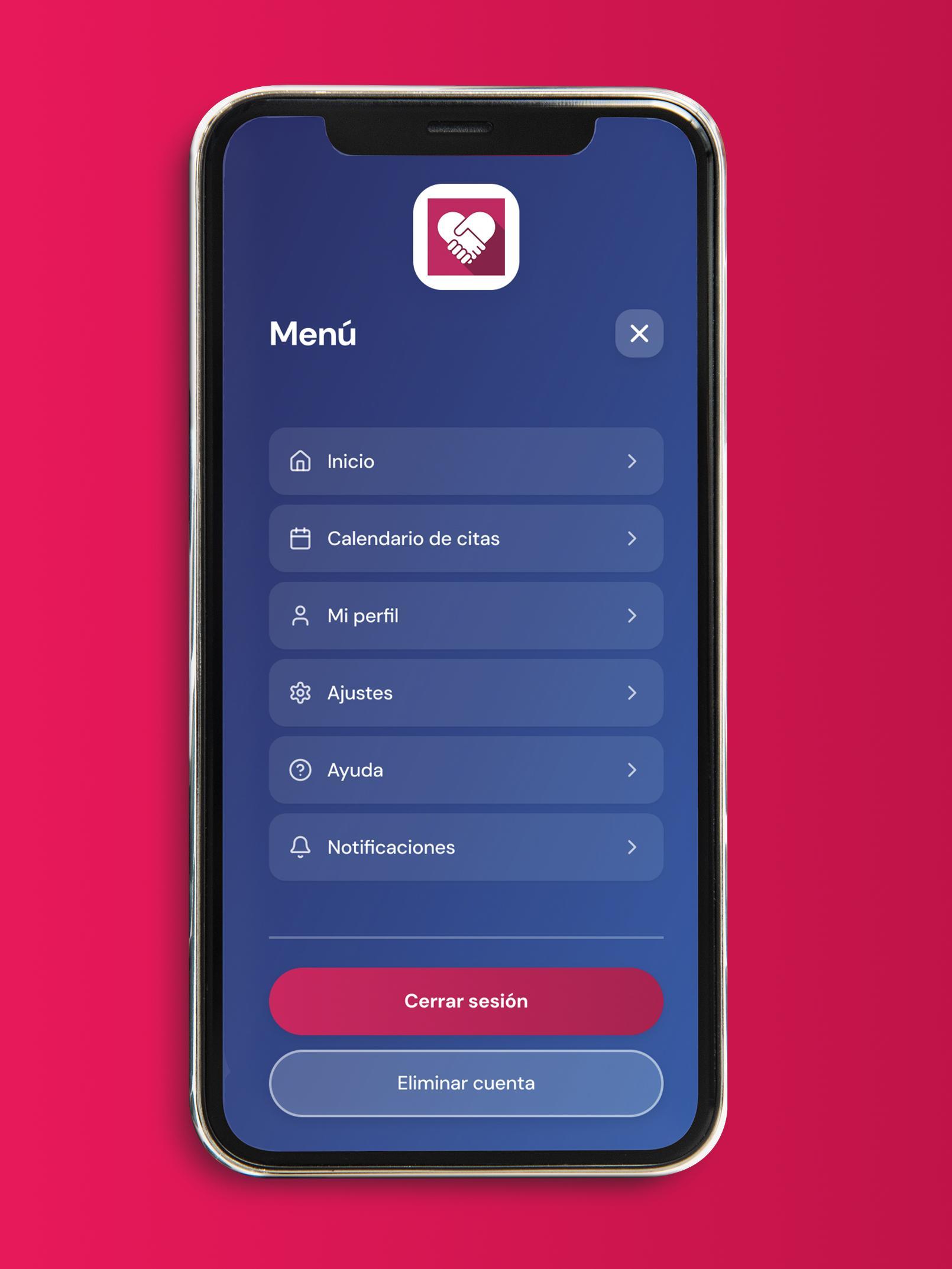
Accessibility over features
The barrier isn't rejection of technology — it's unusable design. Large text, visible buttons, and single-task screens remove the fear of making mistakes. When those elements are in place, users over 65 can navigate complex flows confidently and independently.
✦
Feedback must be explicit and immediate
Icons need clear selected states before any submit action — users must see confirmation that their input was registered before moving forward. One test participant selected a feedback face but saw no visual change, creating uncertainty about whether the tap had worked.
✦
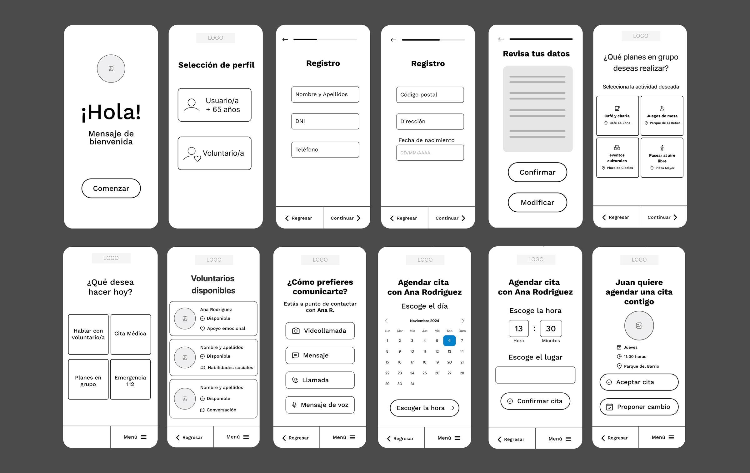
Sequential screens outperform dense forms
Splitting registration across multiple short screens — each with a single task — dramatically reduced cognitive load and errors. Users who finished registration said they felt "in control" and didn't experience the confusion typical of long, scrollable forms.