Let's Talk HIV — Campaign Website Architecture & Clinic Locator Platform
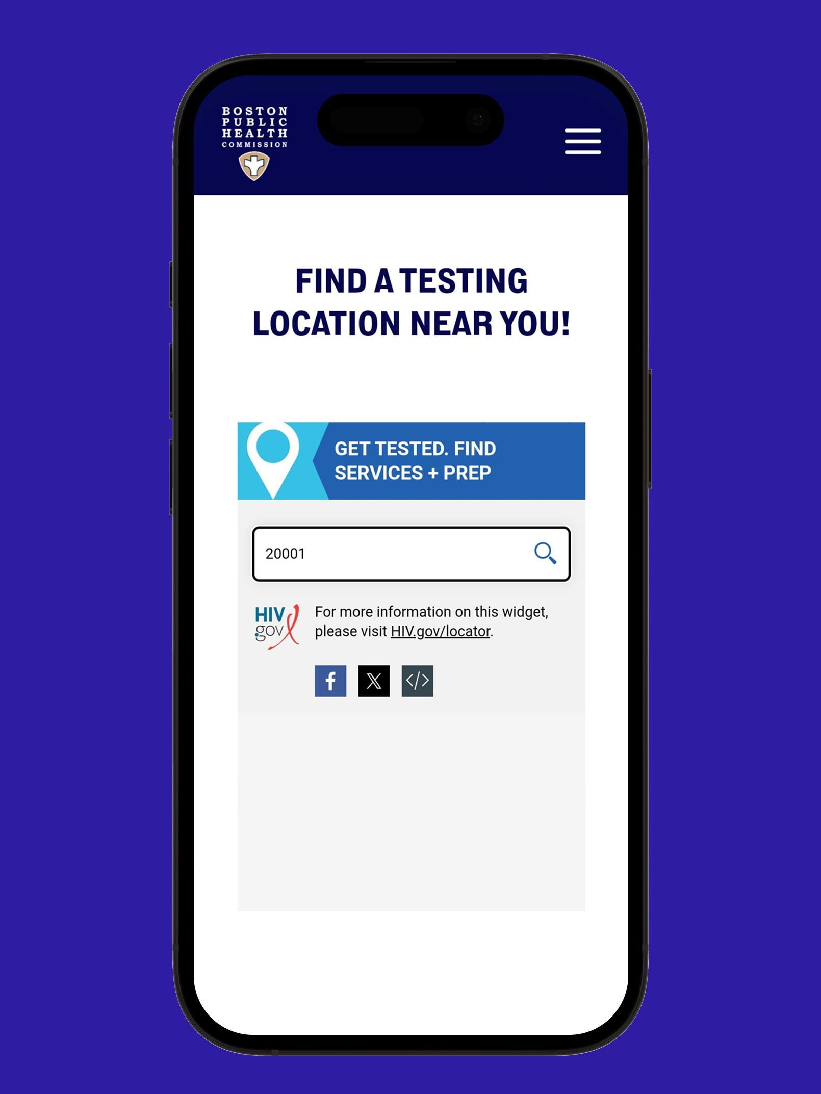
Collaborating directly with the creative team at Squeaky, the primary objective was to architect a high-impact, public-facing awareness campaign website for the Boston Public Health Commission. The critical mission was to demystify testing access by engineering a highly functional, site-specific clinic locator interface.
The platform serves as an intuitive directory allowing users to safely, quickly, and discretely discover physical clinic testing locations across the Boston area — removing friction from what is often a high-anxiety search sequence for communities most in need of accessible care.
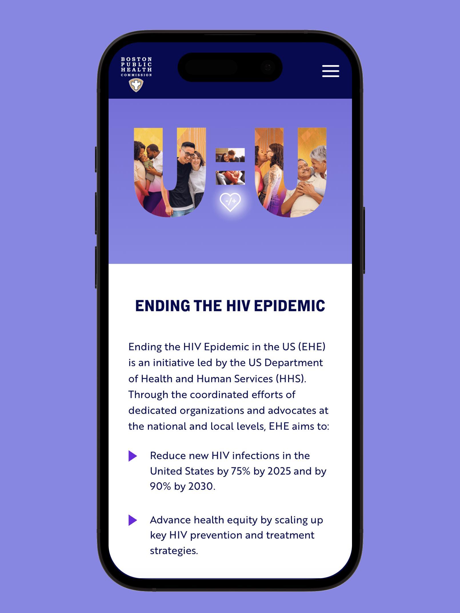
"Demystifying HIV testing access through interface clarity — making the path from curiosity to clinic visit as frictionless as possible."Campaign Design Intent — Boston Public Health Commission, 2024
The campaign required a dual-track solution: a visually striking awareness platform to shift cultural perception around HIV testing, and a precision-engineered clinic locator system that could handle complex municipal directory data with the simplicity of a two-action search.
Every design decision was made in service of one outcome — a user in a moment of hesitation or vulnerability should be able to find their nearest testing clinic without barriers, confusion, or wasted time. Interface clarity as a public health tool.
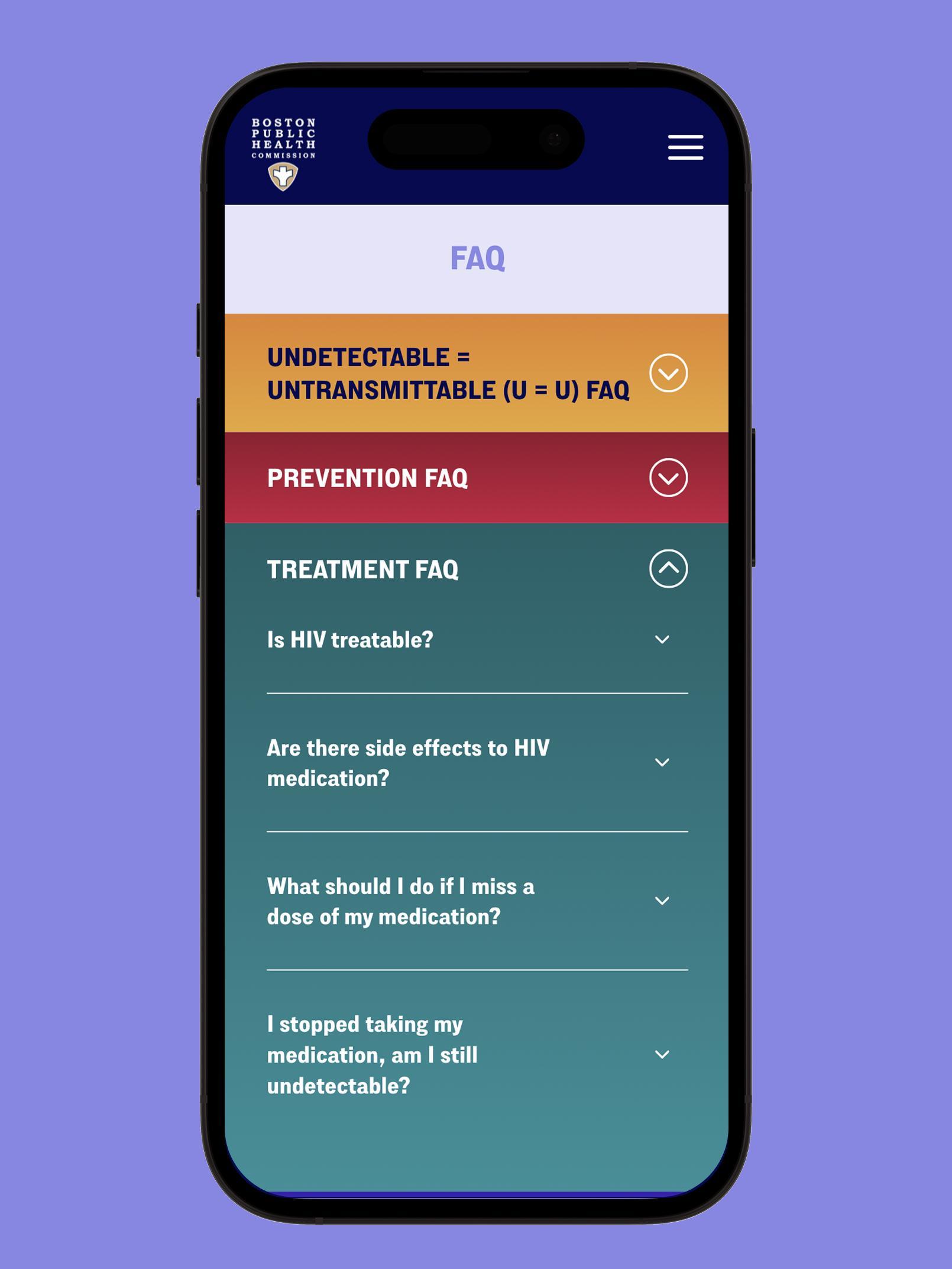
Public health digital platforms operate under a unique set of constraints — users arrive at varying levels of anxiety, stigma awareness, and health literacy. Every UX decision required deep consideration of the emotional context behind each interaction.
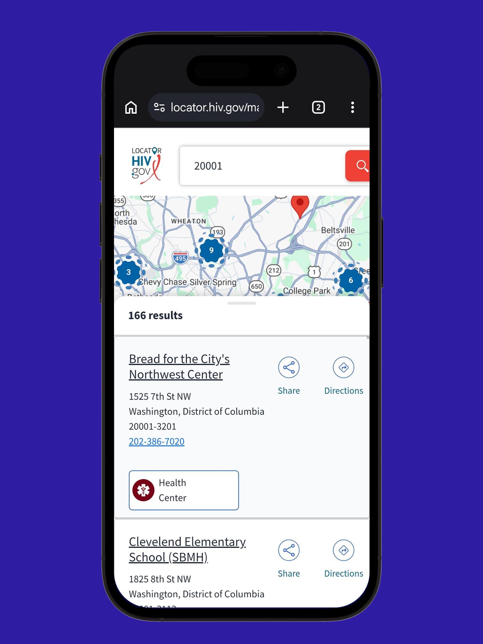
Optimizing complex municipal directory structures into a simplified, responsive location drawer ecosystem. By minimizing interaction friction, users can instantly filter clinical facilities by proximity, operating hours, and resource types in under two actions.
Reviewed the Boston Public Health Commission's existing clinic directory data structure to understand what attributes needed surfacing in the locator — address, operating hours, service types, accessibility, walk-in availability — and how to normalise this into a consistent, filterable data model.
Mapped the full site architecture across both tracks: the campaign awareness flow (landing → education → testing encouragement) and the utility flow (landing → locator → clinic detail → contact/directions). Each path was stripped to its minimum required steps.
The clinic locator was designed as a slide-out drawer pattern — triggered from the map view — surfacing clinic cards with name, address, hours, and service tags. A compact filter bar above the drawer handles proximity and category filtering without leaving the map context.
Applied the campaign's deep crimson accent system against high-contrast white and charcoal panels, balancing health-sector authority with the approachable, human-centric energy the campaign required. Typography hierarchy uses aggressive 900-weight Brother 1816 headings against tight 400-weight metadata in clinic cards.
All screens built at mobile, tablet, and desktop breakpoints. The locator drawer collapses into a bottom sheet on mobile, maintaining full filter and card functionality on smaller viewports. Delivered as a complete Figma component library with annotated handoff documentation for the development team at Squeaky.
The visual system is engineered to balance two competing demands: the institutional authority required of a public health platform, and the warm, human-centric accessibility essential for a stigma-aware campaign. Every token in the system serves both masters simultaneously.
Sharp geometric structure with institutional authority. 900 Black for campaign headlines; 700 Bold for section anchors; 400 Regular for clinic metadata and micro-copy — all from a single, cohesive typeface.
Clinic locator built as a responsive drawer — map context preserved, filter and card surfaces co-present. Bottom sheet on mobile maintains full feature parity at every breakpoint.
Primary Energy Accent (#B03060) applied exclusively to CTAs and critical testing resource markers — creating immediate visual hierarchy without overwhelming the platform's accessible information density.
All contrast ratios validated. Warm pastel component panels maintain legibility under low-vision conditions. Screen reader annotations included in handoff documentation.
A fully responsive campaign platform and clinic locator system delivered in collaboration with Squeaky Agency for the Boston Public Health Commission.
The hardest design problem on this project wasn't the clinic locator's technical complexity — it was the emotional register of every word and every interaction. Stigma-aware design means interrogating the implied tone of every label, button, and error state. The platform had to feel safe before it could feel useful.
Municipal clinic directory data is inherently complex — dozens of locations, variable hours, overlapping service types, and irregular update cadences. The design team's job was to absorb that complexity entirely and present the user with a surface that feels like simplicity. The drawer ecosystem was the solution: filtering power behind a minimal interface.
The strongest decision made early in the process was to treat the awareness campaign and the clinic locator as a single, unified product — not two separate deliverables sharing a URL. That decision gave the platform a coherence that separating them would have destroyed: every campaign element points toward the locator, and the locator carries the campaign's voice throughout.